Human-Computer Interaction
Introduction to HCI
- The goal is to create a scenario where user spends as much time as possible to accomplish the task, while the interface kind of vanishes during that interaction.
- A video game, as an example gives the user an experience of being in the game, not tinkering with the controller.
- We might be experts at interacting with computers, but that does not make us experts at designing interactions between other humans and computers.
- HCI is a subset of Human Factors Engineering (Industrial Design, HCI, Product Design).
- UI Design and UX Design and Interaction Design are a subset of HCI.
- Many principle of HCI come from Human Factors Engineering applied to computers.
- Tha gap between HCI and Interaction Design is shrinking (as computers become ubiquitous).
- HCI is about understanding the interaction between users and computers, and UX design is about dictating the interaction between users and computer. The relationship is however, deeply symbiotic.
- Human Factors Engineering is a merger of Engineering and Psychology.
- Psychology and HCI are also deeply symbiotic.
- HCI is about research (needfinding, prototyping, evaluation) and design (distributed cognition, mental models, universal design).
- HCI at its core: Research informs Design and Design informs Research.
Exploring HCI
Three main application areas:
- Technologies: Virtual Reality, Augmented Reality, UbiComp and Wearables, Robotics, Mobile
- Ideas: Context-Sensitive Computing (equipping user interfaces with historical, geographical, or other forms of contextual knowledge), Gesture-Based Interaction (interacting with interfaces using hand or body gestures), Pen-and Touch-Based Interaction, Information Visualization (representing abstract data visually to help humans understand it), CSCW (Computer Supported Cooperative Work) Interaction (Distributed Team, Distributed Work, Temporal and Geographical dimension): Example: Slack, Online course, etc., Social Computing
- Domain: Special Needs (example: communicating data using sound for visually impaired people), Education (you might not always want to make something super easy), Healthcare (fitbit, virtual reality), Security (for security to be useful, it has to be usable). Captcha has become easy now with a checkbox, Games (topics of HCI are super salient here)
Introduction to Principles
- User uses interfaces to accomplish a task
- Need to understand the user goals and the task
- Focusing on task and not the interface, allows us to come up with something amazing (nest instead of iteration on thermostat)
- How to identify a task?
- Watch real users - get people and ask them to work with you
- Talk to them - talk through the user
- Start small - find small task which user performs
- Abstract up - keep asking why till you reach beyond scope of design (small + small + big - series of why)
- You are not your user
- Goals of HCI:
- Useful
- Usable (the big concern)
- If we were focusing on building better maps, we would not add navigation (think about what the user wants)
- Ex situ - in a controlled or otherwise inauthentic environment
- In situ - within the authentic context
View/Role of a human within a system
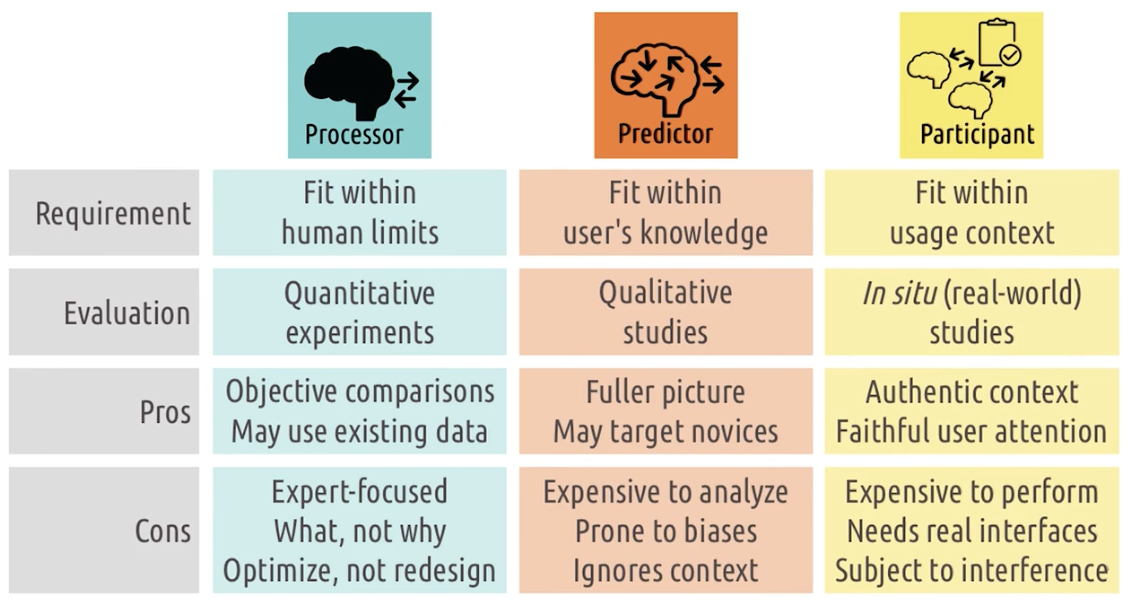
Processor
- Nothing more than Sensory processor, take input and spit output out, like another computer in the system, interface must fit within known human limits: (what humans can sense, what they can store in memory, and what they can physically do in the world)
- usability: interface is physically usable (users can see colors, touch the buttons etc.)
- evaluated by quantitative methods/experiments. - - “Behaviorism” from psychology
- how quickly can the user complete the task?, how quickly can they react to incoming stimulus?
- not the one generally taken when talking about good design.
- The processor model is concerned with objective, measurable outcomes, so noting the efficiency with which you can accomplish different tasks is relevant here.
- Control study
- interfaces and get the timing
- Pros
- Use existing data.
- Objective comparison (text v/s voice).
- Cons
- Reason is not visible
- why text is not better than voice.
- cannot differentiate by expertise.
- Suitable for only evaluation and optimization, not redesign.
Predictor
- Ask interviews and focus groups
- Get full details on textual description
- Why use different interfaces at different time
- why choice, why particular option
- “Cognitivism” from psychology
- here we care about the users knowledge, experience, expectation and thought process, we want users to predict what will happen, what are they thinking, interface must fit with knowledge, evaluated by qualitative studies.
- The predictor model is concerned with what you predict will be the outcome of your action, and whether you can interpret whether the outcome matched your prediction, so focus on how the user perceives and interprets what they should do and whether it was successful.
- The predictor model is not about interfaces predicting users intentions. The predictor model is about paying attention to what the user predicts the outcome of their action will be, and how they will interpret what they see after their action is complete.
- Pros
- More complete picture of interaction
- Caters for experts and novices
- Cons
- Analysis is costly
- Bias in analysis. Focus on specific set of data points.
- Ignore broader context. Example: Only person and interface. Example maps in driving vs map in labs. *5 sec disappearance of search bar
Participant
- Consider broader activity
- not just inside their head but outside world, interface must fit with context, evaluated by in-situ studies (evaluated in the real world).
- “Functionalism/Systems Psychology” from psychology
- Pros
- Evaluates interaction in context
- Capture authentic user attentions
- Cons
- Expensive to perform and analyze both
- Requires real functional interfaces, no prototypes
- Hard to use when starting fresh
- Lots of uncontrollable variables
- Each design informs one another
User experience, Sans Design
- There is always user experience
- UX design focuses on dictating users experience
- It comes due to humans and tasks
- Scope of user experience:
- Individual - Feels of design like vs dislike
- Group - FB keeps people in touch
- Societal - Twitter and Arab Spring
Feedback Cycles
- Way in which people interact with the world and get feedback on the results of those interactions
- Feedback cycles are hallmark of AI
- All of HCI can be interpreted as an application of feedback cycles
- The Gulf of Execution is a term used in the field of human-computer interaction to describe the gap between a user’s goals or intentions and the actions they must take in order to achieve those goals using a computer system.
- The Gulf of Execution refers to the difficulty or complexity a user may experience in understanding and using the system to accomplish their task.
Gulf of Execution
- The distance between user’s goals and the execution of the actions required to realize those goals
- How do the users know what they can do?
- How do the users figure out how to make those goals a reality?
- How do they figure out what actions to take to make the state of the system match their goal state?
- How hard is it to do in the interface what is necessary to accomplish the goals?
- What is the difference between what the user thinks they have to do vs what they actually have to do?
- Phases:
- Identify Intentions (what their goal is) in the context of the system
- Identify Actions necessary to make the goal a reality
- Execute in Interface
Tips for Gulf of Execution
- Make functions discoverable
- Let the user mess around
- Be consistent with other tools - Ctrl+C for Copy, Ctrl+P for Paste
- Know your user - command line vs UI
- Feed-forward - Feedforward (give what will happen if you keep doing same thing, refresh icon on facebook timeline when users drag down)
Gulf of evaluation
- The distance between the effects of those actions and the user’s understanding of the results
- The output of the action that the user took
- Phases:
- Interface output - What did it do upon action (audio/video).
- Interpretation - Can user interpret meaning of output?
- Evaluation - Evaluate the interpretation to check if goals was realized or not.
Tips for Gulf of evaluation
- Give feedback constantly: Give feedback at every step of the process
- Give feedback immediately: Let users know they have been heard (greying out icons when you click)
- Match the feedback to the action (Subtle action, subtle feedback; signification action, significant feedback )
- Vary your feedback (auditory, haptic etc.)
- Leverage direct manipulation (dragging in UI, pulling things around etc.)
Norman’s Feedback Cycle Stage
- The goal: What do I want to accomplish and why?
- Plan: How can I do it?
- Specify: What options do I have?
- Perform: What can I do now?
- Perceive: What just happened?
- Interpret: What does it mean?
- Compare: Is this okay? Have I accomplished my goal?
Direct Manipulation
- Direct manipulation in Human-Computer Interaction (HCI) refers to a style of user interface design where the user interacts with graphical objects on the screen directly and immediately, as opposed to indirectly or through a separate command language. The goal of direct manipulation is to make the interface more intuitive and easier to use by allowing users to manipulate objects and see the results of their actions in real-time. Examples of direct manipulation interfaces include desktop environments like Microsoft Windows and Apple’s MacOS, as well as mobile operating systems like Apple’s iOS and Google’s Android.
- Invisible interface
- Directly manipulating to perform a task (touch screen allowing for zooming with hand gesture)
- Direct manipulation is a powerful method for shortening gulfs.
- VR is also allowing for direct manipulation
Don Normans paper on direct manipulation
Some lessons from the Direct Manipulation Interfaces paper:
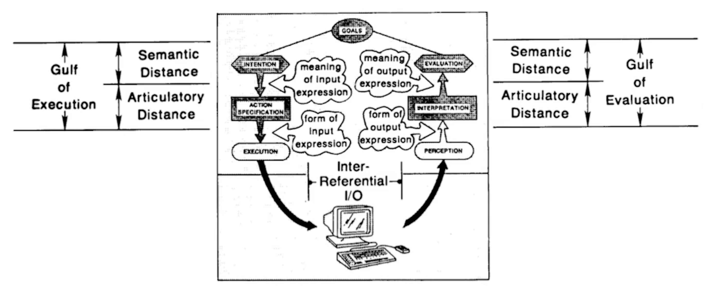
- Distance - the distance between users goals and the system itself. The greater the cognitive load required to use the system, the less direct to the interaction with the system actually feels. Distance can be broken into:
- Semantic distance - distance between users goals and their expression in the system, i.e., how hard it is to know what to do?
- Articulatory distance - distance between that expression and its execution, i.e., how hard it is to actually do what you know to do?
- Direct engagement - systems that best exemplify direct manipulation all give the qualitative feeling that one is engaged with the control of the objects - not with the programs, not with the computer, but with the semantic object of our goals and intentions
Invisibility by learning
- Cars are an example
- Leveraging prior expectation and providing quick feedback
Tips for invisible interfaces:
- Use affordances: Places where visual design suggest how its supposed to be used: buttons for pressing etc.
- Know your user: Invisible means different things to different users.
- Differentiate your user: Allow multiple ways of accomplishing something.
- Let your interface teach: Teach users more efficient ways of doing something.
- Talk to your user: Ask them what the users are thinking (if they are talking about the interface, do they talk about the task or the interface, if they talk about the interface, it is pretty visible).
Human abilities
- Who the human is and what they are capable of doing?
- Input, processing and output
- Input, and how humans react
- Average person can sense and perceive (eyes: color and movement)
- Visual
- Auditory
- Haptic Feedback
- Use recognition over recall
Sensation and Perception - Visual
- Visual system is important for cognition
- HCI is majorly connected to visual perception
- Center - Color
- Periphery - Tracking movement
- Old audiences - Fonts, visual acuity drop
Sensation and Perception - Auditory
- Noises - pitch and loudness
- Ears - Localize sounds near vs far
- Cant process ears (move around)
Sensation and Perception - Skin
- Pressure, vibration and temperature.
- Cant filter touch, like listening
- Its only used for personal feedback
Memory
- Chunking - chunking is a grouping together several bits of information into one chunk
- Perceptual store - very short term memory lasting less than a second.
- Baddley - Hitch memory model
- Visuospatial Sketchpad - stores visual information
- Phonologic loop - (verbal/ auditory information)
- Episodic Buffer - (integrating information from other system)
- Central Executive
- Expertise delays forgetting in perceptual buffer
- Baddley - Hitch memory model
- Short-term memory - memory that is able to hold about four to five chunks at a time
- Chunking is grouping bits of information
- Focus on recognizing things rather than recall them
- Effect of HCI
- Recognition vs Recall - Minibar (recognize the icons)
- Long-term memory - seemingly unlimited store of memories; it is harder to put things into long-term memory than short-term memory
- Put short term memory system
- Reminder experiment - David’s card idea
Cognition
- One of the elements of cognition is learning, there are two types:
- Interfaces should teach them how to learn.
- Procedural learning - how to do something. We do this HCI. Unconsciously competent (Cant translate them to declarative knowledge, as we don’t know). Easy for us to use hard for others.
- Declarative learning - knowledge about something
Cognitive Load
When designing user interfaces, cognitive load comes into play as follows:
- We want to reduce the cognitive load posed by the interface so the user can focus on the task
- We want to understand the context of what else is going on while users are using our interface
- Example - IDE error checking in programming
Reducing cognitive load
-
Tips:
- Use multiple modalities - Visual and Verbal
- Let the modalities complement each other
- Give the user control of the pace
- Emphasize essential content and avoid the clutter
- Offload tasks (to the interface)
-
Perception - main ways people perceive the world around them through sight, sound, and touch.
-
Cognition - memory and learning
-
Motor system - how the person interacts with the world around them
Design Principles and Heuristics
Discoverability
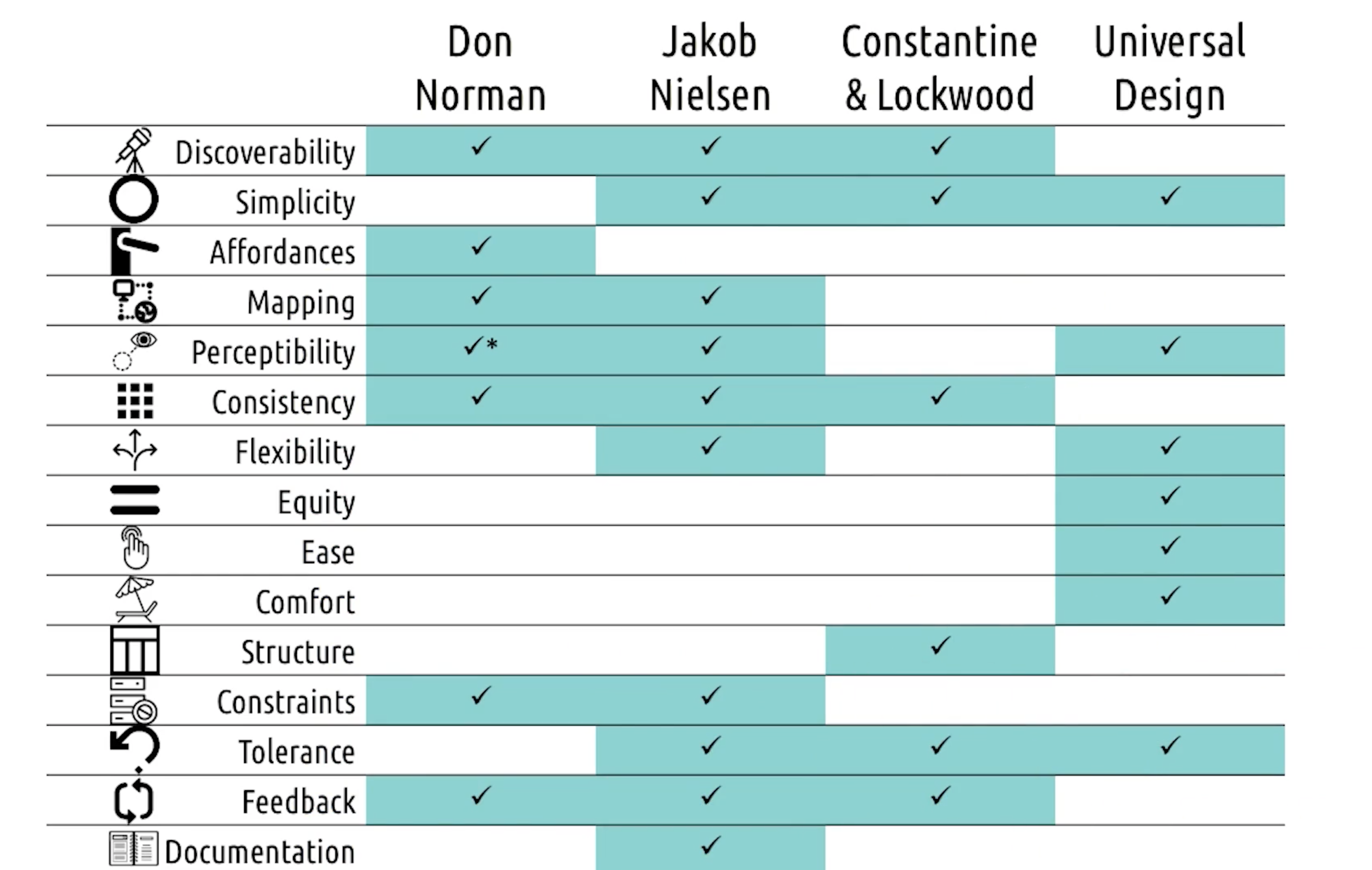
- Relevant function should be made visible so the user can discover them as opposed to having to read about them in some documentation or learn them through some tutorials
- When user doesn’t know what to do, they should be able to figure out what to do
Simplicity
- There is often tension between discoverability and simplicity. One argues to be seen and on argues to keep the interface simple, a balance between these two is often required.
- Use of design is easy to understand, regardless of user’s experience, knowledge, language skills, or current concentration level
- User should be given only whats needed.
Affordances
- The design of the thing affords or hints at the way it’s suppose to be used.
- Signifiers are meant to close the gap between the affordance of an object (how the object suggests it should be used) and the perceived affordance (what the user thinks on how the object should be used).
- Affordance - Inherent property of device. We cant introduce it.
- Perceived - What human perceives. But it can be wrong.
- Signifier - It helps perceived affordance = Affordance
Mapping
- Relationship between two things.
- Mapping user - worlds (cut copy paste)
- Refers to creating interfaces where the design makes it clear what the effect will be when using them (this is different than affordances where affordances suggests how to use objects)
- (think about multiple monitors)
Mapping vs Affordance
- Affordance - design suggests what to do
- Mapping - design shows what the effects will be
- Ex - Light switch
- Whats the effect?
- Dials on stove (icon for burners). More clear.
- Ex - Light switch
Perceptibility
- Refers to the user’s ability to perceive the current state of the system.
- (On or off in switch). Problem in David’s cieling fan
Consistency
- We should be consistent both within and across interfaces to minimize the amount of learn the user needs to do to learn our interface; in this way we create affordances on our own.
- URL in blue in wiki page.
- Common functions across interfaces.
- Ordering menus/ Shortcuts in PPT.
Flexibility
- Wherever possible, we should support the different interactions in which people engage naturally, rather than forcing them into one against their expertise or against their preference
Equity
- Complementary to flexibility, helping all users have the same user experience.
- Avoid segregation and stigmatization.
- In the image below, it might look it they are competing, but no.
- Design is useful and marketable to people with diverse abilities.
- Equity is all about making sure users have similar user experience, and flexibility allows for the means to get there.
- Think Password resets settings
Ease and comfort
- Ease: the design can be used efficiently an comfortably and with a minimum of fatigue;
- Comfort: appropriate size and space is provided for approach, reach, manipulation, and use regardless of user’s body size, posture, or mobility
Structure
- We should organize our user interfaces in ways that helps the user’s mental model match the actual content of the task
- Wall Street website vs print version
Constraints
- Preventing the user from putting an input that wasn’t going to work anyway. UI design is transparent. Constraint is visible.
- Limitting the set of possible actions (to make sure users do not use wrong input, and help users with right input)
- Norman’s four types of constraints:
- Physical - Physically prevent wrong action. USB sticks.
- Cultural - Line in escalator in Japan.
- Semantic - Inherent to situation. Purpose of rare view mirror. Must reflect behind.
- Logical - Self evident based on situation at hand. One hole to one screw.
- How do we deal with constraints? There are two ways:
- Tolerance - users shouldn’t be at risk of causing too much trouble accidentally. Undo and Redo. The design should be flexible and tolerant.
- Feedback - user should be informed on why the error happened and how to avoid it in the future. Worst example: blue screen of death.
Documentation
- even though it’s better if the system can be used without documentation, it may be necessary to provide help and documentation.
- Any such information should be easy to search, focused on the user’s task, list concrete steps to be carried out, and not be too large
- Avoid this all together, but good to have
Mental Models and Representations
Mental Models
- Understanding to the world around you, that you hold in your head
- Mental model - an internal, simulatable understanding of external reality. Good interface will give good mental models.
- Is a person understanding of real word working - processes relationship and connection in real systems
- Predict and check outcome of mental model. Basket ball example. Simulate the event to make prediction
- When reality does match? why is mental model wrong? discomfort, curious? frustration and never will get it.
- Match users models and interface
- Design systems that acts how its expected or teach people how they act.
- Mental models are not unique to HCI. Also in Edtech.
- Good representation show how system works. But very challenging
- Five Principals
- Predictability - User should be able to predict what will happen before perform it.
- Synthesizability - But you should know the process on how you reached current state. Log of commands in CLI.
- Familiarity - Leverage actions with user is familiar. Like affordance.
- Generalizability - Knowledge of one user interface should generalize to others.
- Consistency - Single action and consistent. Ctrl+X for cut only.
Representations
- Internal symbols for an external reality. Helps users learners to use our interface quickly.
- Make the solution self evident.
- Here are some characteristics of good representations:
- Depicts explicit relationships - Laying thing out helps easy understanding
- Brings objects and relationships together - Objects and relationships are explicit.
- No extraneous information - Say only left to right, left out stupid information.
- Expose natural constraints - Brings environment into pictures.
Analogies And Metaphors
- If you can ground your interface in something users already know, you can get a solid foundation in teaching them how to use your interface. Ex - Wall street website and paper are similar.
- However, when you use analogies to other interfaces, users may not know where the analogy ends. Therefore, we should pay special attention to misconceptions analogies introduce.
- Analogies make the interface more learnable, but they may restrict the interface to outdated constraints.
- Metaphors and analogies - used to create good representations.
Design Principles Revisited
- How do mental models and representations tie into HCI design principles?
- Analogies and metaphors - Principle of consistency
- Interfaces should teach the user how the system works - Principle of affordances
- Representations map the interface to the task at hand - Principle of mapping
Learning Curve
- Expertise vs Experience. Above line of proficiency.
- Rapid Learning curve with limited experience
- Difficult interface have slower learning curves
- Consistency with analogies and representations
Slips
- The user has the right mental model, but does the wrong thing anyway
- Norman’s division:
- Action-based - Places where the user performs the wrong action, or performs the right action on the wrong object, even though they knew the correct action
- Memory lapse - Occurs when the user forgets something they knew to do
Mistakes
- The user has the wrong mental model, and does the wrong thing as a result
- Norman’s division:
- Rule-based - occurs when the user correctly assesses the state of the world but makes the wrong decision based on it
- Knowledge-based - occur when the user incorrectly assesses the state of the world in the first place
- Memory lapse - similar to memory lapse slips but focuses on forgetting to fully execute a plan
Learned Helplessness
- A user’s sense that they are helpless to accomplish their goals in an interface. Window hang while reading large dataset.
- It’s related to educational technology.
Expert Blind Spot
- When you are an expert in something there are parts of the task that you do subconsciously without even thinking about them.
- I am not my user.
Task Analysis
- Human information processor model
- Cognitive Task analysis (similar to the predictor model)
Human information processor model
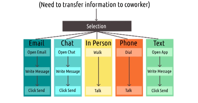
A human information processor model; it builds off the processor model of the human’s role in a system. One of the human information processor model is teh GOMS model. There are four categories in the GOMS model:
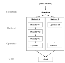
- Goals - users goals in the system
- Operators - user operations to carry out method
- Methods - user can use to complete (Methods - Operator 1—n)
- Selection rules - which to select among different methods
This model proposes that a human has a set of goals and methods they can choose from to accomplish those goals. Each method is comprised of a series of operators which help carry out that method. Lastly, they use some set of selection rules to help decide what method to choose from.
Example - Transfer information to coworkers - Email, chat, In person, etc.
Strengths And Weaknesses Of GOMS
- Weaknesses of GOMS model:
- Does not address complexity - There are many methods and sub-methods. Standard GOMS rules this out.
- Assumes user is an expert - GOMS doesn’t account for novices and user errors. I don’t know highway in USA.
- Strengths of GOMS model:
- Formalize user interaction into steps - Interaction steps to measure for efficiency. Helps to narrow down the time for each steps. Finding areas of improvement. Count time for each operator, easy to get keychain while holding something in hand.
Types of GOMS
- KLM-GOMS -> Keystroke level model
- here operator + execution time - efficiency determination
- original work had 6 types of operators, won’t work on modern ideas
- CMN GOMS -> Card, Moran and Newell GOMS
- Hierarchical Goals and choose multiple goals
- Very low level goals (moving text, delete phrases)
- Model how long each individual GOMS to take
- Find place which we can cut out
- NGOMSL - Natural language GOMS
- Working memory if exploited can be identified
- lends itself for human interpretation.
5 Tips: Developing GOMS Models
- Focus on small goals
- GOMS should be small, abstract up from there.
- Example - Navigating end of document
- Nest goals, not operators
- GOMS of Navigation
- GOMS for changing lanes and plotting routes
- Operators are smallest atoms of GOMS models. Don’t breakdown further
- GOMS of Navigation
- Differentiate descriptive What people do? and prescriptive What they wanna do?
- GOMS of former doesn’t mean they will do later. They will not do that?
- Assign costs to operators
- Measurement of operators will take.
- Use GOMS to trim waste
- Use GOMS to cut cost by reducing operators.
GOMS to Cognitive Task Analysis
- The GOMS model assumes the human is an input-output machine (processor model).
- However, human reasoning may be too nuanced and complex to be so simplified.
- Cognitive task analysis is another way of examining tasks but it puts a much higher emphasis on things like memory, attention, and cognitive load (predictor model).
- Behaviorism vs Cognitivism
- Observable of things
- Get into mind
Cognitive Task Analysis
Its collection of methods focus on what we cant see.
Cognitive task analysis are concerned with the underlying thought process associated with performing a task. Most methods follow a particular common sequence:
- Collecting preliminary knowledge
- No experts needed, but need some familiarity (observe people performing tasks)
- Identify knowledge representations
- What does user know what they need to complete a task. Ex: Ordering of tasks/ Memorization etc.
- For navigation, monitoring and sequence of actions.
- Apply focused knowledge elicitation methods
- Identify task, knowledge by think out loud about it.
- Get user to tell us what they have in mind.
- What changed their approach, what did they do in prior and what they do after change.
- Analyze and verify data acquired
- Confirming if understanding is correct
- Format results for intend application
- We take results and models user
Result looks like a flow chart, with various tasks in each box.
Hierarchical Task Analysis
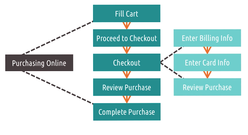
- Tasks could be broken and small tasks could be reused. In the image above, Checkout can be represented as a subtask.
- This form of task analysis helps us understand what tools might already be available to accomplish certain portions of our task, or how we might design certain things to transfer between different tasks and different contexts.
- Hierarchical task analysis process:
- Abstracting out unnecessary details for a certain level of abstraction.
- Modularizing designs or principles so that they can be transferred between different tasks or different contexts.
- Organizing the cognitive task analysis in a way that makes it easier to understand and reason over.
Cognitive Task Analysis Strengths And Weaknesses
- Like the GOMS model, cognitive task analysis also have strengths and weaknesses.
- Strengths:
- Emphasizes mental processes: Unlike GOMS, emphasis on whats goes on users head
- Formal enough to for interface design: Easy to communicate and compare
- Weaknesses:
- Time-intensive - They involve talking and systematic analysis of data
- May deemphasize context - Role of artifacts and details in world
- Ill-suited for novices - Who is trying to use an interface.
Other task analysis
Human information
- KLM - Keystroke level model
- TLM - Touch level model
- MLP - Model human processor
- CPM-GOMS - Parallel tasks.
- NGOMSL - Natural language.
Cognitive Models
- CDM - Critical decision model - Focus on critical decision
- TKS - Task knowledge structures - Focus on user knowledge.
- CFM - Cognitive function model - Focus on complexity
- Applied CTA
- Skilled CTA
Distributed Cognition
- Distributed cognition suggests models of cognition should be extended outside the mind.
- An example is you can either add large numbers in your head (much more difficult) or add large numbers on a piece of paper.
- Each object in the the process can be said to extend the cognitive process. Don’t get smarter by pen and paper, cognition got distributed among the artifacts.
How A Cockpit Remembers Its Speeds
Given the dynamic nature of flight, how does a cockpit remember its speeds?
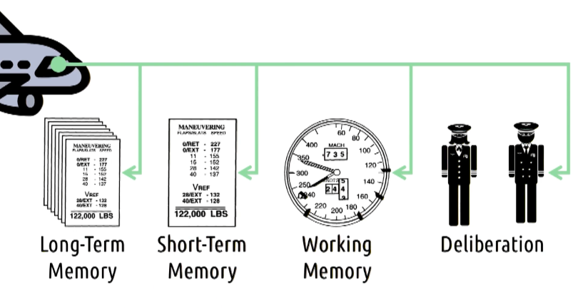
The paper references to a cockpit and not one individual component as the cockpit comprises of more than one cognitive component to remember speeds:
- Long-term memory: a library of configurations (booklet)
- Short-term memory: a specific configuration (one sheet)
- Working memory: use of speed bugs on a dial
- Deliberation: the two pilots in the cockpit
- Each one of these components helps in remembering the speed of a plane by serving as an individual cognitive component in the cognitive system.
- Distributed Cognition To Cognition Load
- Artifacts are extra memory to brain. Driving example is cognitive overload. GPS is a approach. Cruise control. Offload tasks to artifacts
- Distributed Cognition as Lens
- A way of approaching/looking at the problem/design. Separation of monitors.
Distributed Cognition To Social Cognition
- Distributed cognition is concerned with how the mind can be extended by relations with other artifacts and other individuals.
- Social cognition is concerned with distributing cognition across individuals. Example : map reading during driving in old days.
Social Cognition
- Social cognition is about how social connections create systems that can, together, accomplish tasks. For example, you and your friend navigating to a place.
- Social cognition is also concerned with the cognitive underpinning of social interactions themselves. it is interested in how perception, memory and learning relate to social phenomenon. (Think designing social media)
Situated Action
- Situated action is strongly concerned with the context within which people interact.
- However, situation action is not interested in the long-term and enduring permanent interactions amongst these things.
- Situated action is interested in the kinds of novel situational problems that arise all the time. How do we find out more about these problems?
- We must examine the interfaces we design within the context in which they’re used
- We must understand the task the user performs grows out of interaction with the interface
- The task doesn’t exist until the user gets started, and once they start, they define the task
Situated Action And Memory
- Memory is context dependent. People will often remember e.g., a list of personal tasks because it is part of a larger narrative versus remembering a list of tasks someone else gave them.
Activity Theory
- A massive and well-developed set of theories regarding interaction between various pieces of an activity.
- This theory predates HCI and there are some contributions of activity theory to HCI we should be aware of:
- Task to Activity theory
- Why we see task and then design
- Up and down hierarchy - due to learning.
- It predates HCI
- Activity theory generalizes our unit of analysis from the task to the activity; we’re not just interested in what users doing but why users are doing it
- Activity theory puts an emphasis on the idea that we can create low level operations from higher level actions
- Activity theory points out that actions by the user can actually move up and down a hierarchy
- There are several similarities between Activity Theory and Distributed Cognition (both are focused on goals, where as Situated Action is focused on improvisation)
Interfaces and Politics
Designing for change, and anticipating the change from our design.
Change: A Third Motivation
There are three goals of HCI:
- Help a user do a task
- Understand how a user does a task
- Change the way the user does a task
Car - Seatbelt example - Not usability but safety.
Paper - Do artifacts have politics?
- Nuclear Power
- Can be used in Totalitarian. Push for tech carries politics
- Solar power equalitarian society
Two types
- Inherently political
- Nuclear power (top down)- Authoritarian
- Solar Power (distributed) - Egalitarian society
- Technical arrangements as forms of order
- Technology can change social order - Context and purpose - Busting unions.
Change By Design
- Ability of interfaces to change behavior can be abused.
- Normal designs with underlying politics
- People can design things to intentionally create a negative (designing bridges too low so that it’s harder for poor people to go to a destination) or positive change (Facebook’s like button).
- Wealthy people can go to park, low bridges for poor people (social order),
- Net neutrality
- Positive interactions: Like button and emotions in Facebook. Societal trend.
Change By Happenstance
- Need not always by design. Bicycle - Societal change
- Women using cycle instead relying on someone, wardrobe change.
- While people could intentionally create a positive or negative design, this could happen unintentionally as well for positive (the bicycle giving women freedom to travel independently) and negative (internet access) cases.
- Existing Infrastructure and Internet
Value-sensitive Design
- Value-sensitive design seeks to provide theory and method to account for human values in a principled and systematic manner throughout the design process.
- Another dimension to consider while designing: Usable, Useful and Value sensitive
- Privacy by design - Privacy is the value. Preserve value.
Value-sensitive Design and Information Systems
- Conceptual Investigations - Thought experiments, role value play in stakeholders
- Empirical Investigations - target users - exploring how they make sense of values
- Technical Investigation - target systems -
Fundamental feature - Proactive, usability vs human values,
Value-sensitive Design Across Cultures
One of the challenges of value-sensitive design is that values are different across cultures (culture that values privacy vs cultures that value frees speech due to censorship).
- Right to be forgotten, value held by EU. Google was not developed based on that.
- Not universally shared.
- Privacy vs Free speech.
5 Tips: Value-sensitive Design
- Start early - Identify values early on design process and check throughout
- Know your users - Know user’s values. Challenges are to be identified.
- Consider both direct and indirect stakeholder - People who don’t user but affected by it. Bank UI.
- Brainstorm the interface’s possibilities - How it could be used. Tracking hours - unjust call for termination.
- Choose carefully between supporting values and prescribing values - We should not prescribe values for everyone. Be careful about support and change.
Reversing The Relationship
- Technology changes society but society could also change technology too (e.g., demand for single platform to link to others for TV subscriptions).
- Bulbs - florescent bulbs vs Electricity Bill
- Satisfaction of politics, preserve power of organization.
Conclusion To Principles
- Human As Processor: At the narrowest level, we might view HCI as the interaction between a person and an interface. This view is shared by models such as the GOMS model.
- Human As Predictor: Most of the time we are viewing HCI as the user interacting through some interface to accomplish some task. At this level we can look interactions in terms of the gulf of execution and evaluation. We can use tools like cognitive task analysis and hierarchical task analysis to understand things like user’s mental models, errors, and mappings between representations and the underlying tasks. Design principles are made.
- Human As Participant: At the highest level, we are interested in how interactions occurs beyond just the individual, interface, and task. At this level we can look at interactions in terms of activity theory where interactions include elements of the context surrounding the task. We could also look at how artifacts combine to accomplish a task through distributed cognition. Other times we can look at deeply understanding the situated context in which a person is acting through situated action. Additionally, we could also look at how users integrate through norms and relations with social cognition. There are times where we should keep in mind the intended and unintended positive and negative changes our designs might have on society during design.
5 Tips: On-Screen UI Design
- Use a grid
- Use a whitespace
- Know your Gestalt principles - how user perceive and group projects.
- Reduce clutter - #1-#3 helps in this.
- Design in grey-scale
Gestalt principles
The following are the key Gestalt principles:
- Law of proximity: This principle states that objects that are near each other tend to be grouped together.
- Law of similarity: This principle states that objects that share similar characteristics, such as shape, color, or texture, tend to be grouped together.
- Law of closure: This principle states that people tend to perceive incomplete shapes or forms as complete objects by filling in the missing information.
- Law of symmetry: This principle states that people tend to perceive objects that are symmetrical as a single unit or figure.
- Law of continuity: This principle states that people tend to perceive objects as continuous and flowing, even when they are interrupted by other objects.
- Law of figure-ground: This principle states that people tend to perceive objects in a scene as either figures (the objects of focus) or the background against which they are seen.

Introduction to Methods
Research Methods
- Design better than existing design
- In order to design interactions that are better than existing designs, it is important to take into consideration the user needs at each stage of the design process
- New way to old task
- Novelty should have the purpose, and understand the users task
User Centered Design
- Prioritizing user needs while recognizing we do not know their needs
- Design is often done to meet some functional specification, instead of meeting the user’s need
- You are not your user
Principles of User-Centered Design
- There are six principles of user-centered design:
- The design is based upon an explicit understanding of users, tasks, and environments - Do needfinding Leverage this knowledge throughout the design process.
- Users are involved throughout design and development - Interviews, Surveys, working on design team etc.
- The design is driven and refined by user-centered evaluation. Real users evaluate the prototype.
- The process is iterative - No single shot results. Even after being realesed.
- The design addresses the whole user experience - Entire experience is to be considered.
- The design team includes multidisciplinary skills and perspectives - CS Scientists, Pyschologists, Designer, Domain experts and more.
Stakeholders
- There are many types of stakeholders who user or are impacted by our interface:
- Primary - Our user who uses the interface directly. Grade book tool - Teachers send progress reports to parents
- Secondary - are people who don’t use our system directly but who might interact with the output of it in some way. - Grade book tool Parents receive the output.
- Tertiary - are people who never interact with the tool or output but who are nonetheless impacted by the existence of the tool. Grade book tool - Students
The Design Life Cycle
- User-centered design is about integrating the user into every phase of the design life cycle. We need to know two things:
- What the design life cycle is?
- How to integrate the user into each phase?
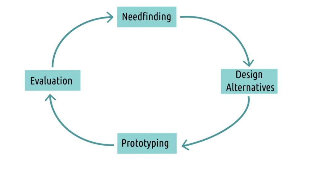
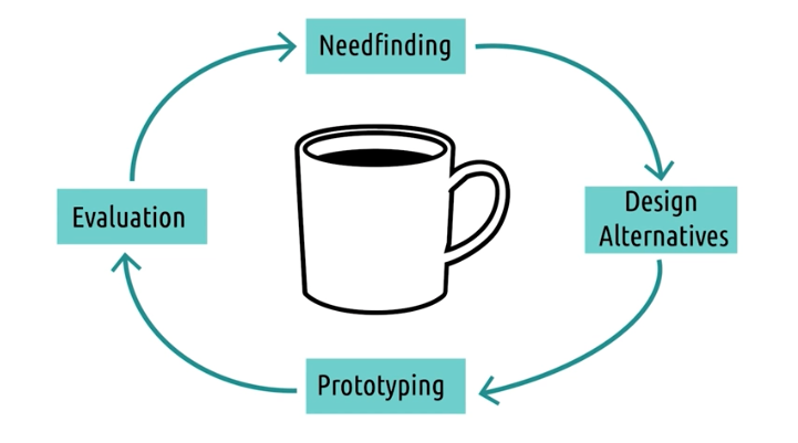
- The design life cycle in four phase:
- Needfinding: gather comprehensive understanding of task the user is are trying to perform: who the user is, what the context of the task is, why they are doing the task, and any other information
- Design alternatives (early ideas on different ways to perform a task)
- Prototyping (low fidelity to improved, so that we can put it in front of our users)
- Evaluation (put them in front of our users)
- The cycle does not end at product launch.
Quantitative data
- Descriptions, Measurements
- Observations described or summarized numerically
- Supports formal tests, comparisons, and conclusions
- Is strong for a small class of things
- Captures narrow view of what we might be interested in examining
- What
Qualitative data
- Preferences, Performances
- Observations described or summarized non-numerically
- Supports any kind of response or observation
- Covers a broader picture of what we’re examining
- More flexible, but it is more prone to biases
- Description, observations, natural language
- Convert qualitative to quantitative data.
- How and Why
Mixed method: A mixture of qualitative and quantitative data from same participants.
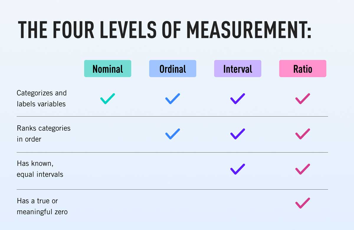
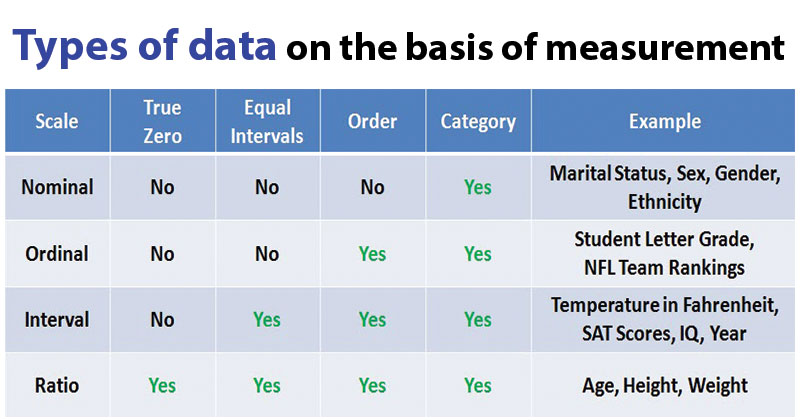
Types Of Nominal Data
There are four main types of quantitative data:
- Nominal - Categorical - Number of instances of different categories
- Single nominal - One category
- Multiple nominal - More than one category
- Binary (yes/no) and Non binary
- Ordinal - Similar to nominal, but there is explicit ordering. Scale of 1-5. Gap is unclear.
- It can be multinominal
- Binary (Fail/Pass) and Non binary
- Interval - We do know exact difference between value. Commuting between 4-6am. 64 degree celcius is not twice as warm as 32. Can be Discrete or Continious.
- Ratio - Ratio data. Absolute value and ratio could be established. Can be Discrete or Continious.
Types Of Qualitative Data
- Depends on how its gathered
- There are many types of qualitative data, below are some examples:
- Transcripts - Interview/Focus group
- Field notes - Participant Observation
- Artifacts - Reviews for Existing interfaces
- Others - Many more/ Not mentioned
- Span is a lot larger
- Expensive to analyze, interpretation bias
- Qualitative data -to- Quantitative using coding
- We don’t loose, only transformation
- Documented methodology is obtained (for review purposes/reproducibility)
- Always mix qualitative and quantitative data in HCI
- Typically these transformed data are nominal
Ethics and Human Research
Origin Of Institutional Review Board
- Due to unethical experiments such as the Milgram Experiment, Tuskegee Syphilis Experiment, and Stanford Prison Experiment the National Research Act was enacted (1974). This led to the creation of institutional review boards to oversee research at universities.
- In general, the benefits to society must outweigh the risks to the subjects in the case of these experiments.
- Belmont Report - summarizes basic ethical principles that research must follow in order to receive government support.
- demanded rigorous consent procedures
- positive outweighed negatives and rights are always preserved
- benefits of study should outweighs risk to participants
- Fair selection of subjects
Value of Research Ethics
- Benefits are worth the risk and are significant in nature.
- IRB is sensitive about coercions when participants feel coerced, it impacts our results.
- Inherent bias on participants, effect on results.
- Not just ethical, but doing good research.
- IRB also monitors the research is sound and useful.
IRB Protocol
- Protocol is a description regarding a project
- Status: Approved, New Waiting for PI, Withdrawn, Waiting for Sign-Off
- Add research personnel
- Protocol title
- Select role
- Certification is needed
- Primary Investigator (PI) will be always first, and must be a faculty
- How to create a protocol in IRBWISE
- Protocol description covers study at high level.
- Research design and methodology (what users will experience and in what order)
- Experimental designs
- Duration of participation
- Data collection methods
- Benefits outweigh the risk
- Risks are to be added.
- Statistical Analysis (Qualitative research might not have this)
- Start and End dates
Human Subject Interaction details
- Will directly involve direct interaction
- describe subjects and data we plan to collect (are we being fair to all genders)
- Vulnerable population - special accommodation is to be needed (they might not have the ability to give full consent)
- Scientific justification is needed for no of participants
- Effect size is needed
- Inclusion and Exclusion status
- Subjects age ranges
- Recruitment plan - (how are we going to find our subjects)
- Compensation provision
IRB Consent Procedure
- What kind of consent is received? Written or Waiver
- Some narrow circumstances - Now direct effect
- Waiver of documentation of consent
- Written consent is only identity of participant
- Implied consent and can withdraw anytime
- Justification is needed for consent waiver
- At risk population needs more information
- Concealment, deception - Temporary prototype is needed
- Upload concent form
Data Management Question
- Clinical research and Biological research
- How do we keep data safe
- DoD, Radiation and Nano tech - Involvement
- Interview script, recruitment script, survey etc.
- No conflict of Interest and submit to PI.
Needfinding and Requirements Gathering
Introduction to Needfinding
- Avoid preconceived notions (if all you have is a hammer, everything looks like a nail)
- Defining general questions about the user
- Generating answers about the user
- Formalizing models of the users
Data Inventory
Some understanding of the data we want to gather. These are the questions we want to answer:
- Who are the users? Age, gender, level of expertise etc
- Where are the users? What is their environment?
- What is the context of the task? What is competing for user attention?
- What are their goals? What are they trying to accomplish?
- What do they need? What are the physical objects/information/collaborators they need?
- What are their tasks? What are they doing physically, cognitively, socially?
- What are their subtasks? How do they accomplish those subtasks?
The Problem Space
- Where is the task occurring? What else is going on, what are the user’s explicit and implicit needs?
- broader view of the problem space
- start with general types and observations and move through progressively more targeted types of need finding.
User Types
- Full range of users for which we are designing
- Task is usually the same for both, but the audience, their motivation and their needs are different
- Identify different types of user and perform needfinding exercise on all of them
- Kid vs Adults
- Experts vs Novices
Avoiding Bias in Needfinding
- Confirmation bias: we see what we want to see, preconceived ideas, test empirically, keep samples covered, involve multiple individuals in needfinding process
- Observer bias: Subconsciously bias the users. Avoid leading questions
- Social desirability bias: Make naturalistic observations, record objective bias.
- Voluntary response bias: Oversampling. Reduce survey shown.
- Recall bias: Misleading and incorrect recall, resulting in faulty data, people are not good what they did during activity done in past.
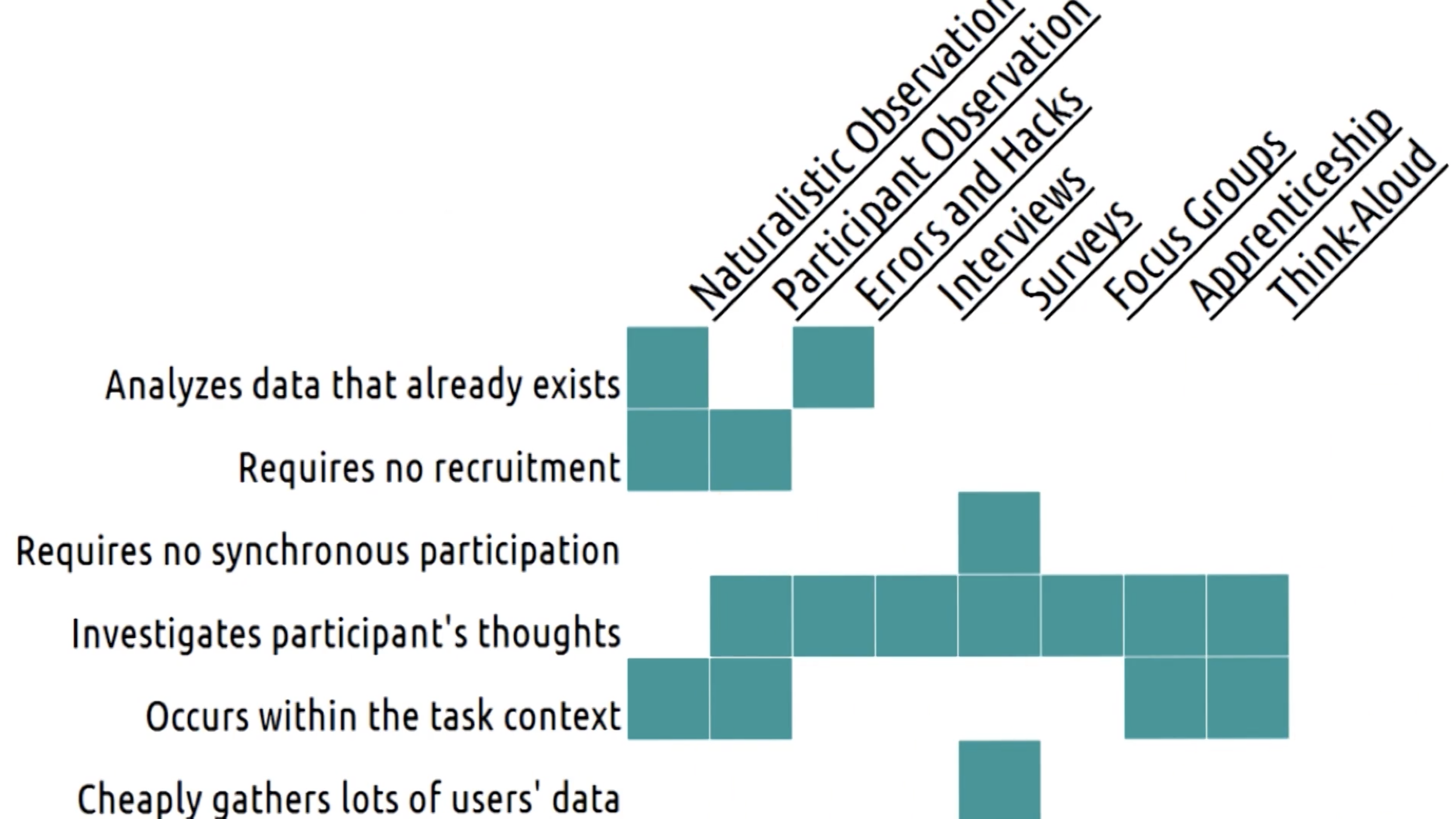
Naturalistic Observation
- Observing people in their natural context
- Cannot interact with users directly
- Not sure what those users are thinking
- Tips on Naturalistic Observation
- Take notes
- Start specific, and then abstract (do not summarize too soon)
- Spread out your sessions
- Find a partner
- Look for questions
- Five tips to use during observation:
- Take notes - Gather targeted information and observation about what you see.
- Start specific, then abstract - Risk Tunnel vision. Write down individual action, do not summarize/analyze from the beginning
- Spread out your sessions
- Find a partner - Take notes and compare with partners
- Look for questions - Should inform questions what you need during targeted needfinding
Participant Observation
- Although you are not your user, you can act as a participant
- Do not overrepresented your own experience
Hacks and Workarounds
- How do users use hacks/workarounds to accomplish a task?
- But ask them why they use the hacks
Errors
- Slips or mistakes that users frequently make while performing the task within the interface
- Errors happen because of weak mental models
Apprenticeship and Ethnography
- Researching a community by becoming a participant in it (become an expert in it: pretty much)
Interviews and Focus Groups
- Just talk to them
- Focus group can lead to convergent thinking
- 5 Tips for effective interviews:
- Focus on the 6 W’s (who, what, where, when, why and how), open ended semi structured questions, Avoid yes and no, use openended and semiphrases questions
- Be aware of bias
- Listen
- Organize the interview (introduction, lighter qn for trust gathering, summary at end for the user to understand the purpose)
- Practice
Think-Aloud
- Asking user to think out loud while in the context of the task
- Useful because we get info that user might forget later, but thinking out loud might cause them to act differently
- Post-Event Protocol (is better option)
Surveys
- Larger number of questions/surveyors
- Not as through, but powerful to get large number of data
- Also helpful in identifying what to ask during interviews
- Tips:
- Less is more
- Be aware of bias
- Tie them to inventory
- Test them out
- Iterate
- Questions in survey:
- Be clear: Code numbers with what they mean (likert), don’t ask overlapping range, time box frequency based questions
- Be concise: Might be a tradeoff with clear, ask in plain language
- Be specific: Avoid double barrel questions, avoid questions that allow internal conflict, avoid questions on super big ideas
- Be expressive: Allow users to be expressive, emphasize users opinions, user ranges instead of yes/no questions, give levels of frequency or agreement, allow users to add nominal categories
- Be unbiased: Leave open ended question open, avoid loaded questions (wasted vs spent)
- Be usable: Provide progress bar, page length consistency, order your questions logically with a flow, alert users about unanswered questions, preview survey yourself.
Other Data Gathering
- Logs, Product Reviews, Already existing reviews (critique already existing interface) etc.
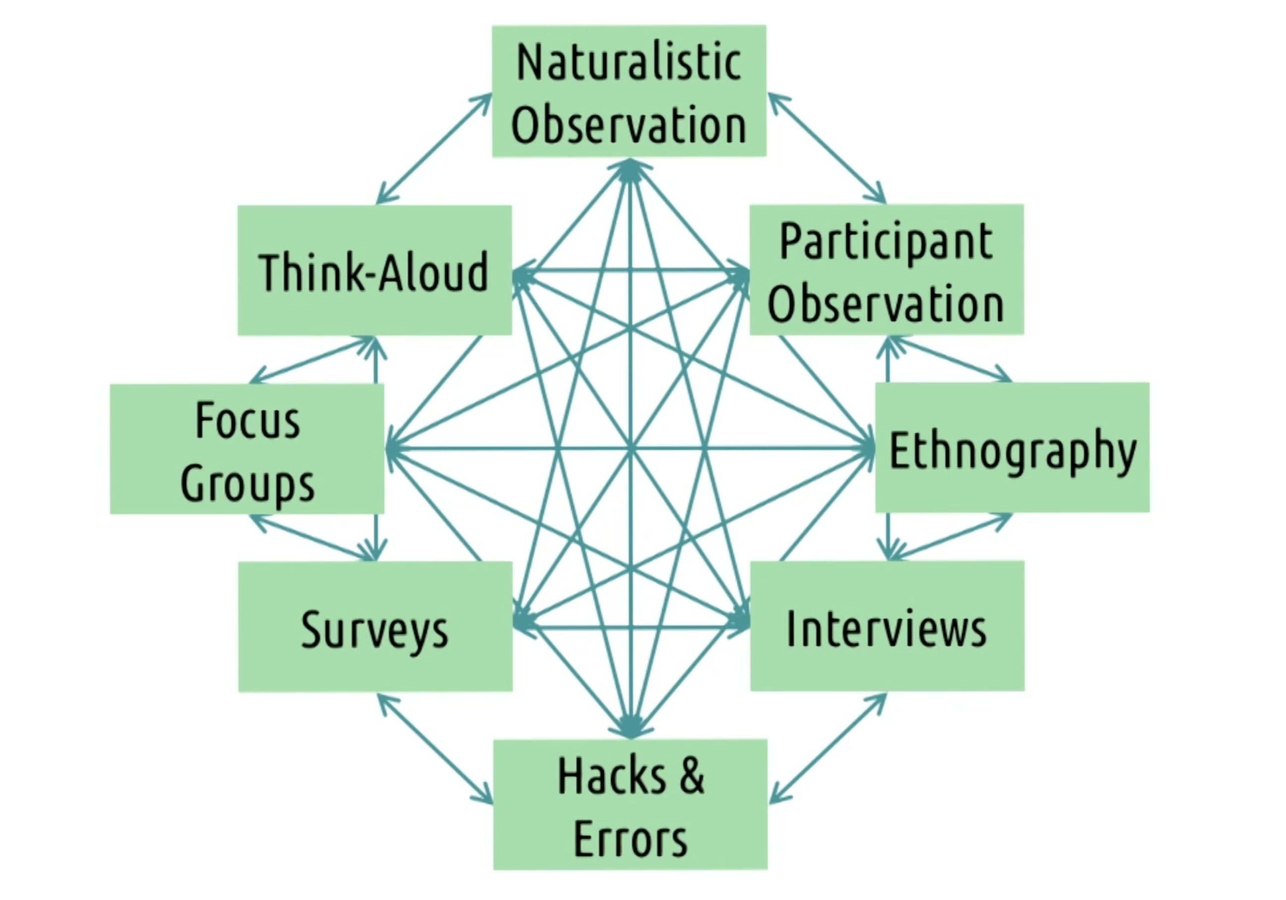
Iterative Needfinding
- Needfinding on its own can be a cycle
Revisiting the inventory
Revisit these:
- Who are the users? Age, gender, level of expertise etc
- Where are the users? What is their environment?
- What is the context of the task? What is competing for user attention?
- What are their goals? What are they trying to accomplish?
- What do they need? What are the physical objects/information/collaborators they need?
- What are their tasks? What are they doing physically, cognitively, socially?
- What are their subtasks? How do they accomplish those subtasks?
Representing the Need
- User needs can be formulated to something usable
- Task and subtasks, hierarchy, flowchart with decisions, diagram of structural relationships between the components in the system and how they interact.
- summarize to task analysis (data gathered can summarize task analysis)
Defining the Requirements
- They should be specific and evaluative
- Functionality, usability, learnability, accessibility
- Compatibility, compliance, cost
- Used to evaluate the interface going forward
Design Alternatives
- The biggest mistake a designer can make is jumping straight to designing an interface without understanding the users or understanding the task.
- The second biggest mistake is settling on a single design idea or a single genre of design ideas too early.
- After having a good understanding of needs of our user, brainstorm on task we have been investigating
- The settling on a single idea can take on multiple forms:
- Staying too allegiant to existing designs or products
- Focusing too strongly on one alternative from the very beginning
- Tunnel vision: focusing on one alternative from the very beginning
- Design space: the area in which we design our solution
- Our goal during the design alternative phase is to explore the possible design space. We do not want to narrow down the design space too early.
Brainstorming
- Explore possible design space (brainstorm lots of potential spaces)
- Start with individual brainstorming
- Generate lots of ideas
- Groups tend to coalesce around conclusion earlier
- Tips on individual brainstorming
- Write down the core problem
- Constrain yourself
- Aim for 20
- Take a break
- Divide and conquer
Challenges in Group Brainstorming
- The challenges are:
- Social loafing - the tendency to exert less effort working in groups than working alone
- Conformity - the tendency to agree with or follow the group’s reasoning and ideas
- Production blocking - the tendency of some individuals in discussions to block other individual’s participation
- Performance matching - the tendency to match one’s level of performance to other collaborators
- Power dynamics - the tendency to defer to more senior individuals, or to overpower less senior individuals (gender, race, etc.)
- Rules for Group Brainstorming
- Expressiveness - Any idea that comes out share out loud
- Non-evaluation - No evaluation
- Quantity - More ideas better
- Building - Build on the other ideas
- There are four additional rules:
- Stay focused - keep goal in mind
- No explaining ideas - Say idea and move on
- Revisit the problem - Hit a road block and revisit
- encourage others - Encourage them to do so.
- 5 Tips for group brainstorming
- Go through every individual idea
- Find the optimal size
- Set clear rules for communication - Set timer and no one can block others
- Set clear expectations - How long session wil go? set an expectation
- End with ideas, not decisions - several ideas and come back to pursue
Fleshing out ideas
-
some ideas can be dismissed easily, which is fine
-
combine multiple ideas, dismiss with some analysis
-
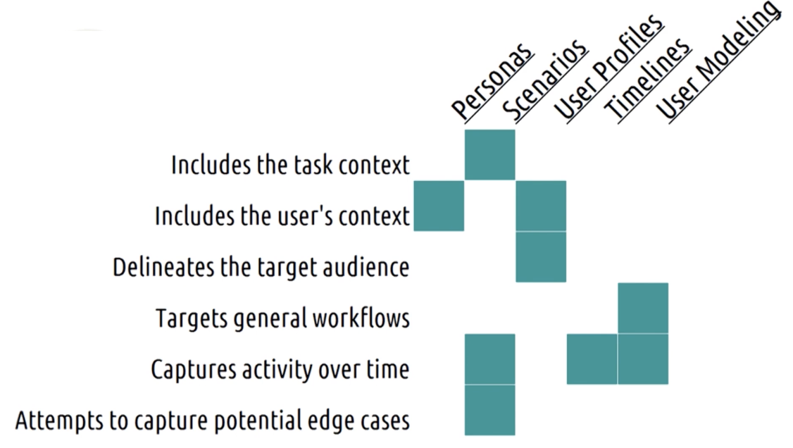
Here are methods to flesh out ideas:
- Personas - create actual characters to represent our users. Emphatic reasoning.
- User profiles - defining a number of different variables about our users and possibilities within each - Expertise, Motivation, Usage Frequency, Literacy etc.
- Timelines/Journey Maps - Take a persona and stretch out over time. What does a user do before/during/after the task? What action lead to the task? What do they do later? What are they thinking when they are doing the task?
- Scenarios and Storyboards - Examining the specific scenarios users will encounter while using our interfaces (a more specific approach). Timelines tend to be pretty general, scenarios are more specific. Particular user, particular events, while performing particular task. Ambulance/Audiobook example. Pretty close to mockups.
- User modeling - Where personas are personal and will give us an empathetic view of the UX, user models are more objective and meant to give us measurable and comparable view of the UX. GOMS model. How does the user achieve a goal? Identification of phases and efficiencies.
Prototyping
Basics Of Prototyping
Some basics to prototyping:
- Early prototyping - rapid revision on preliminary ideas
- Late prototyping - finishing touches on final design/revising already live design
Representation (Types)
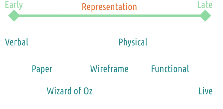
Different prototype representations from early (low-fidelity) to late (high fidelity):
- Verbal prototype: A verbal prototype is a concept or idea that is described in words, without any visual or physical representation. It can be used to quickly test and refine ideas without investing time or resources in creating a physical prototype.
- Paper prototype: A paper prototype is a simple, low-fidelity mockup of a product that is made using paper or cardboard. It is used to test the layout and functionality of a design, and can be easily modified as needed.
- Wizard of Oz prototype: A Wizard of Oz prototype is a type of interactive mockup that simulates the behavior of a fully functioning product by using human operators to perform the actions that would normally be performed by the product itself. This type of prototype can be used to test user interaction and identify usability issues before building a fully functional prototype.
- Wireframe prototype: A wireframe prototype is a visual representation of a product that shows the layout and structure of the interface, without including detailed graphics or other design elements. It can be used to test the flow and functionality of a design.
- Physical prototype: A physical prototype is a working model of a product that is built using real materials. It can be used to test the form and function of a design and identify any manufacturing or engineering issues that may need to be addressed.
- Functional prototype: A functional prototype is a working model of a product that includes some or all of the features and functionality of the final product. It can be used to test the performance and usability of a design before beginning mass production.
- Live prototype: A live prototype is a fully functional version of a product that is released to a limited audience for testing and feedback. It can be used to identify any remaining bugs or usability issues before launching the product to a wider audience.
Fidelity
Fidelity - Completeness/Maturity of prototype. Far from being complete. Correlated to representation.
Evaluation
- Prototype evaluation from early to late:
- Function - Low fidelity - what button to press ? Can it do what it is meant to do? Can user figure out what to do by looking at it?
- Interface - Readability
- Performance - Higher fidelity - working/closing to working output
Scope
- Prototype scope from early to late:
- Horizontal prototype - covers the design as a whole but in a more shallow way
- Entire FB website
- Vertical prototype - great detail on a small portion of the interaction
- Status posting screen
Tradeoffs In Prototyping
We must note tradeoffs in prototyping:
-
Low-fidelity prototypes:
- Pros: easy to create and modify
- Cons: not as effective for detailed comprehensive evaluations
-
High-fidelity prototypes:
- Pros: can be used for detailed feedback and evaluation
- Cons: difficult to actually put together
-
Remember that we are designing to get more feedback.
-
Start easy get ideas and move to higher fidelity.
-
Not complete interfaces.
5 Tips: Prototyping
- Keep prototypes easy to change - Enable rapid revision (paper vs code)
- Make it clear that it’s a prototype - Don’t make too good, make it look like prototype
- Be creative - Do whatever it takes to get feedback. Find ones that get feedback.
- Evaluate risks - Minimize time spent on bad design by getting feedback early. Don’t waste time.
- Prototype for feedback - Goal of prototype is feedback. Prototype for kind of feedback.
Design Life Cycle Revisited
- We do not just move to the evaluation stage after we are done with prototyping, rather a single prototype corresponds to a single iteration through the cycle.
- Success of prototype -> Raise the fidelity
Multi-Level Prototyping
- All prototypes do not have to be at the same level at the same time. Instead, prototyping can and should exist at multiple levels of fidelity.
- Don’t do everything, part could be done from low to high fidelity.
Evaluation
Three Types Of Evaluation
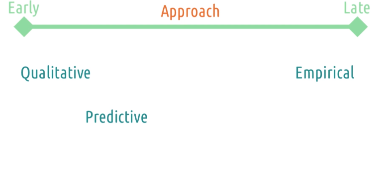
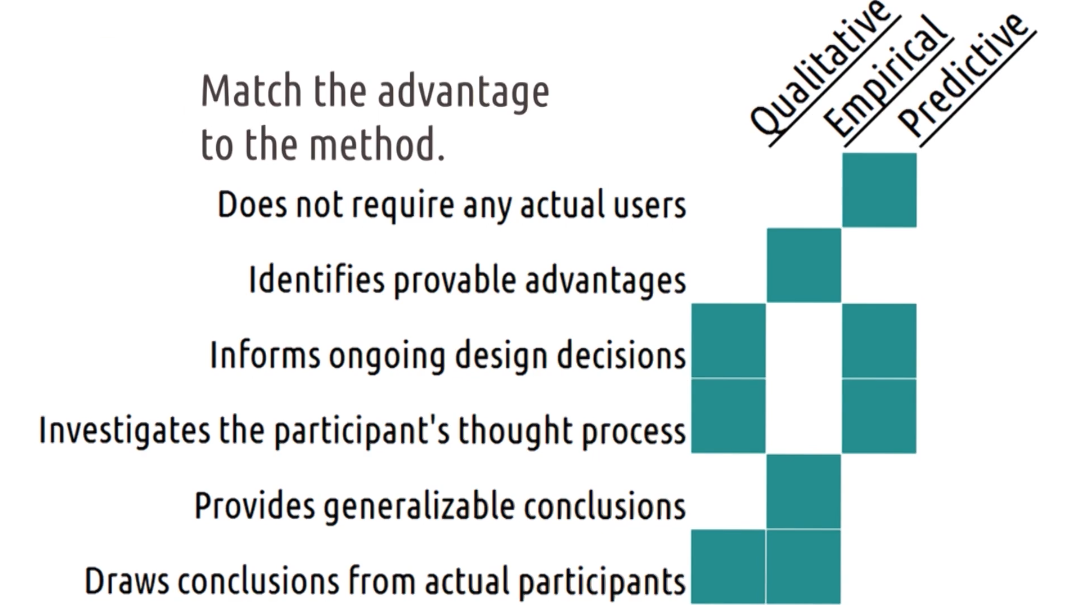
- Qualitative evaluation - evaluation that emphasizes the totality of a phenomenon. Likes dislike need doesn’t need, easy vs hard etc.
- Empirical evaluation - evaluation based on numeric summaries or observations of a phenomenon. More participants and qualitative is done in prior.
- Predictive evaluation - evaluation based on systematic application of pre-established principles and heuristics (no users).
Evaluation Terminology
- Reliability - whether a measure consistently returns the same results for the same phenomenon.
- Validity - whether a measure’s results actually reflect the underlying phenomenon (reality and results)
- Generalizability - whether a measure’s results can be used to predict phenomena beyond what it measured. Broader Audience (may or may not be applicable to all).
- Precision - the level of detail a measure supplies
5 Tips: What To Evaluate
- Efficiency - how long does user take to achieve text (Expert)
- Accuracy - how many users does users commit while executing a task (Expert)
- Learnability - How long does user take to reach expertise.
- Memorability - users ability to remember on how to use interface over time.
- Satisfaction - Cognitive load, how many actually download the app? - Social desirability bias.
- Important things needed to address the research:
- What data are you gathering?
- What are you evaluating ?
- What approach will you use to evaluate?
Evaluation Timeline
Change in evaluation with time, The evaluation timeline usually is as follows:
- Regarding purpose:
- Formative - primary purpose is to help redesign and improve our interface (early)
- Summative - the intention of conclusively saying at the end what the difference was (late, hopefully we only do formative)
- Regarding approach: Ways to fullfil purpose
- Qualitative - the goal is to help us improve and understand tasks (early)
- Predictive - inform how we revise and improve our interface over time (Similar to qualitative evaluation)
- Empirical - the goal is to demonstrate or assess change (late)
- Regarding data:
- Qualitative - always useful to improve our interfaces (early and late)
- Quantitative - while always useful, can only arise when we have rigorous evaluations (late)
- Regarding setting: where does it take place.
- Lab testing - helps us focus exclusively on the interface early on
- Field testing - helps us focus more on the interface in context
Evaluation Design
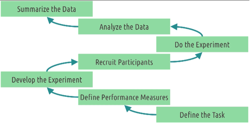
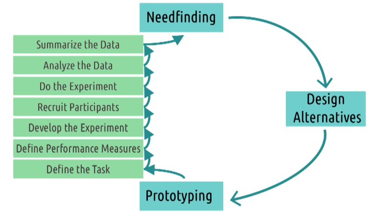
- Define the task - very large or very small task.
- Define performance measures - how are we going to measure this. Define it and avoid confirmation bias. Create metrics. Qualitative vs Quantitative.
- Develop the experiment - How we find user performance on the measures. Survey or Interview/ What to control or vary empirically.
- Recruit participants - Ethics - right awareness
- Do the experiment
- Analyze the data - what data tells about performance measures. Do followups if you find something extra than expected.
- Summarize the data - Informs ongoing process
Qualitative Evaluation
- Get qualitative feedback about the interface.
- There are some questions we want to ask in this evaluation: (Similar to interviews)
- What did you like/dislike?
- What were you thinking while using this interface?
- What was your goal when you took that particular action?
- Methods - Interview/Survey/ Think out load protocol/Focus Groups
- Use these techniques to get feedback on how our prototype changes the task.
Designing A Qualitative Evaluation
There are options when designing a qualitative evaluation:
- Prior experience or live demonstration? - bring user in to test. Mostly later case
- Synchronous or asynchronous? - watch live or complete and send
- One interface or multiple prototypes? - Vary the order based on bias.
- Think aloud protocol or post-event protocol? - explain while doing or do later at the end.
- Individuals or groups? - Focus groups (build and expand)/ Only source of knowledge (bad) but no bias.
Capturing Qualitative Evaluation
Options to capture qualitative evaluation:
- Video recording
- Pros: Automated, comprehensive and passive (focus on administering)
- Cons: Intrusive, non-analyzable and screen-less. Overwhelming on analyses.
- Note-taking
- Pros: Cheap, Non intrusive (Capture what we do/not everything) and Analyzable
- Cons: Slow, Manual and Limited
- Software logging
- Pros: Automated, passive and analyzable
- Cons: Limited (only some parts could be captured), Narrow and Tech Sensitive (prototype needs to reach certain level of fidelity)
5 Tips: Qualitative Evaluation
- Run pilot studies - Recruiting is hard, gather useful data . Use friends and coworkers
- Focus on feedback - Don’t explain rationale, don’t teach. Take it and design.
- Use questions - when user get stuck? Guide user
- Instruct users what to do, not how - Reduce bias
- Capture satisfaction - Do they like it?
Empirical Evaluation
- Something numerical in evaluation. What layout of button is useful?
- Comparing design and showing improvement in industry.
- Build new theories (gesture has tuf curve than voice)
- How can we show there is a difference between these designs?
- The goal of empirical evaluation is to come up with strong conclusions. Most empirical evaluations are comparisons.
Designing Empirical Evaluation
- Treatment - what a participant does in an experiment. Difference interface or design and comparison between them. Difference between two logo should be based on design color should be only comparable.
- Between subjects design - comparison between two groups of subjects receiving different treatments. What do participants do or both treatment?
- Within subjects design - comparison within one group experiencing multiple treatments. Both treatments are given, what are seen first? order is randomized.
- Random assignment - using random chance to decide what treatment each participant receives. Control bias.
Hypothesis Testing
- Reaction time study? Data is generated and compare this.
- Hypothesis testing - testing whether or not the data allows us to conclude a difference exists.
- Null - Assume oppose is true
- Alternative if data doesn’t support that. Less than 5% chance.
Quantitative Data And Empirical Tests
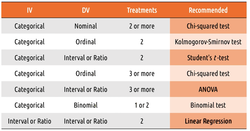
Recall that there are a number of tests for quantitative data:
- Nominal
- Recommended - Chi-squared test
- Alternatively: Fisher’s exact test, G-test
- Ordinal:
- Recommended - Kolmogorov-Smirnov test
- Alternatively - Chi-squared test, median test
- Interval and ratio:
- Recommended - Student’s t-test
- Alternatively - MWW test, Kruskal-Wallis test
Special Test
- Three independent variable (hypothesis)
- Do pairwise
- Repeated testing
- False positive
- Falsely reject null and agree alternative hypothesis.
- Type I Error (False Positive): False rejection of null hypothesis
- Type II Error (False Negative): False retention of null hypothesis
- Fishers exact and G-test
- Where is the difference?
- ANOVA and Kruskal Wallis (Interval and Ratio)
- Where is the difference?
- Independent variable is mostly categorical. GPA is interval data.
- Binomial Data - Two sample binomial test
Summary Of Empirical Tests
Below is a summary of empirical tests:
5 Tips: Empirical Evaluation
- Control what you can, document what you can’t - Try to make treatments identical as possible
- Limit your variables - Noisy data false conclusion and monitor handful of things at a point.
- Work backwards in designing experiments - Decide what question you want to answer, the anaysis you want to use and the question you want to ask
- Script your analyses in advance - Do not torture data.
- Pay attention to power - Size of difference the test can detect.
Predictive Evaluation
- Predictive evaluation should only be used where we wouldn’t otherwise be doing any evaluation.
- Rapid feedback, appropriately and when users are not available.
Types Of Predictive Evaluation
- Heuristic evaluation - each individual evaluator inspects the interface alone, and identifies places where the interface violates some heuristic. Sit with an expert and get the report.
- Model-based evaluation - tracing through models in the context of the interface we designed (e.g., GOMS model). We can also compare interfaces. Also profiles of users could be used.
- Simulation-based evaluation - where we might construct an AI agent that interacts with our interface in the way a human would. The human project - IIIT Germany.
Cognitive Walkthrough
- The most common type of predictive evaluation is actually cognitive walkthrough.
- Cognitive walkthrough - stepping through the process of interacting with an interface, mentally simulating in each stage what the user is seeing and thinking and doing. To do this, we start with task and goal.
- predict what action will user take
- Noting system response
- Investigate gulf for each step
- it may be fine for us, but we can put to user shoes we can identify something missing.
Evaluating Prototypes
Our goal is to constantly apply multiple evaluation techniques to center our designs on the user.
- Qualitative evaluation.
- Some quantitative evaluation.
- For all the prototypes.
HCI and Agile Development
The Demand For Rapid HCI
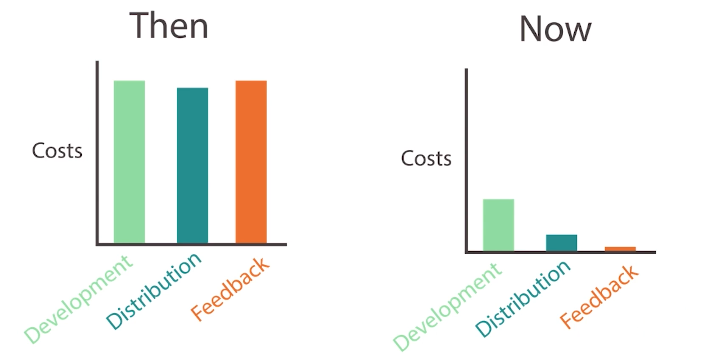
- Before, costs for development, distribution, and feedback regarding software and products were expensive compared to now.
- Specialized development skills
- Distribution is physical
- Fix was hard
- By have users to come into testing
- How do we take the principles we have covered so far and apply them to a rapid agile development process?
- Cheap development
- Internet distribution - Free and update
- Usage data is free and live. Lots of feedback
- More incentive to build and save
When To Go Agile?
We can make the decision to go agile by considering the following:
| Traditional | Agile | |
|---|---|---|
| Criticality is… | High | Low |
| Requirements change.. | Rarely | Frequently |
| Team size is… | Large | Small |
| Team embraces… | Order | Change |
Towards a framework for integrating agile development and user-centred design (UCD).
Similarities and Differences Between UCD and Agile Development
- They rely on an iterative development process, building on empirical information from previous cycles or rounds. For instance, one of XP’s values is feedback, and the idea of refactoring code is an embodiment of this value. In UCD one of its founding principles is iterative design
- Agile techniques place an emphasis on the user, encouraging participation throughout the development process. For instance, in Scrum, user evaluation of the product is encouraged on a monthly basis as users are ideally present during the sprint review and the “Product Owner” is responsible for the requirements and feature prioritization for the product. A second founding principle of UCD, is early and continual focus on users.
- Both approaches emphasis the importance of team coherence. Beck states that one of the purposes of the planning game is to “bring the team together”. One of the features of the UCD approach is that the whole team should have the user in mind while developing the product.
The two main differences are:
- UCD advocates maintain that certain design products are required to support communication with developers, while agile methods seek minimal documentation.
- UCD encourages the team to understand their users as much as possible before the product build begins, whereas agile methods are largely against an up-front period of investigation at the expense of writing code.
Live Prototyping
- Optimizers - Drag and drop interface. Small revision its awesome. Benefit is high.
- Final interface vs Prototype
- Allows to get feedback
A/B Testing
- Rapid software testing between two changes. B version to small users and change as positive before to all.
- Real user testing
Agile HCI In The Design Life Cycle
- Agile development techniques don’t replace the design life cycle, they just change the rate at which we go through it and the types of prototypes and evaluation that we actually do. We’re still going to do the initial need-finding step.
5 Tips: Mitigating Risk In HCI And Agile Development
- Start more traditional - Once you have something up and running, move to agile
- Focus on small changes - Don’t make huge change
- Adopt a parallel track method - 2 week sprints, have HCI one sprint ahead
- Be careful with consistency - Don’t mess with user expectation
- Nest your design cycles - Small cycles rapidly in Agile
Approaches To User-Centered Design
There are different approaches to user-centered design:
- Participatory design - all the stakeholders including the users themselves, are involved as part of the design team but we must be careful not to over represent the few users that are participating in the design with the rest of the users out there
- Action research - addresses an immediate problem and researches it by trying to simultaneously solve it
- Design-based research - similar to action research but it can be done by outside practitioners as well. Common in learning science research